

With the World Cup rapidly approaching, the shirts that the 48 teams will wear are starting to be released in the shops.
The fashion of football fans wearing their team colors during games (whether in the stadium or a local bar) has turned replica shirts into a US $10 billion industry. Nevertheless, many predict that there is plenty of growth left in the market, with a projection of it reaching $20 billion by the end of the decade.
Some of the 2026 kits, made by Adidas and Puma, were released just before Christmas; those by Nike, as well as most “away” kits — also an important section of the market — are expected to come out in March and April. “Cool fans” often opt to wear these.
Football fashion in Mexico
When fans got their first look at this Cup’s Mexico shirt, there was a collective sigh of relief. Mexico has a reputation for producing some classic football shirts, both for the national team and for the Liga MX clubs. Although fashion is a matter of personal taste, Mexico did receive two nominations on “The 100 best football kits of all-time” list published by the British magazine FourFourTwo — one of the most accepted of such lists by fans. Club America’s 1994/95 shirt took No. 20 on this list, and the Mexico World Cup shirt of 1998 was No. 16.
However, fans had a few concerns leading up to the release of the 2026 kit, as recent years had brought some underwhelming designs. The 2024 “peacock” shirt was unpopular, and in 2025, Mexico broke with tradition at the Gold Cup and played in black. Influenced by both Mariachi bands and the Mexica Empire, it was not a bad design, but it did not win the country’s soccer fans’ support, with many disapproving of the move away from the traditional green!
Then, in April 2025, there was a buzz on the internet when pictures of the 2026 shirt and it appeared we were heading for another break from tradition: The leak revealed a green shirt with three thick vertical bars down the center, a design that appeared to be loosely based on the 1978 World Cup away shirt.
This had been a reasonable design at the time, but it now looked dated. These early drafts of the 2026 shirt resulted in internet-wide cries of horror, and so Adidas went back to the drawing board.

Kudos on the current design for ‘El Tri’ in the 2026 FIFA World Cup
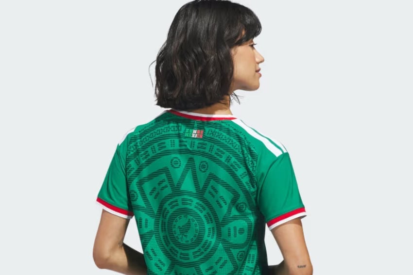
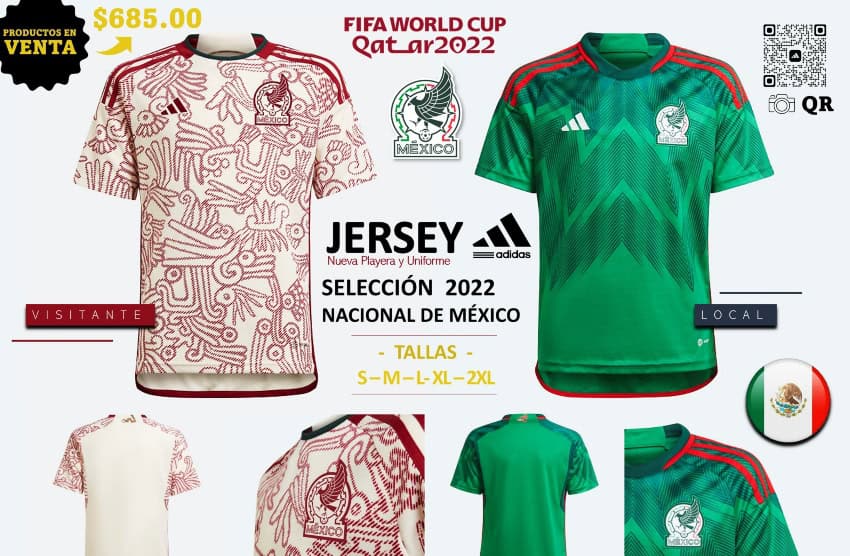
The design officially released has met with universal praise, being closely based on the classic design of 1998. What made that shirt so unique is that Mexico moved away from the big international sports companies, instead turning to a local firm, ABA Sport, which, since entering the market, had produced some excellent designs for Mexican clubs.
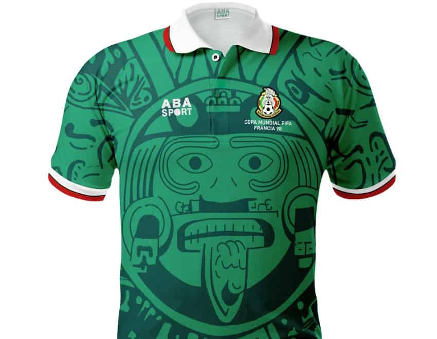
The 1998 shirt used the standard green with red-and-white trims but drew from the country’s cultural heritage with the Mexica calendar incorporated into the design. This was a brave idea which could have flopped, and had the Mexica image been any more pronounced on the shirt, it would have looked far too cartoonish. Luckily, the image enhanced the design and didn’t dominate it.
The 2026 shirt, while adapting much of the 1998 design, has used a more subtle motif, to good reviews — a welcome “return to the more daring,” according to the Cult Kit website, while the ESPN reviewer noted that the “elaborate pattern and eagle crest are sure to elevate this to instant ‘modern classic’ status.”
A 7-stage guide to the history of Mexican national team soccer shirts
1928-1954
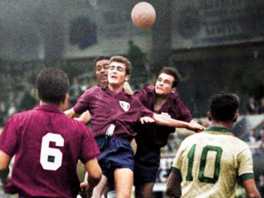
When Mexico made its debut in a major international football tournament at the 1928 Olympics, the team played in dark-burgundy shirts with black or dark-navy shorts. It is uncertain why these colors were chosen above the green, red and white of the national flag.
One story is that the dark-burgundy color was linked to the Mexica, who created a similar color by crushing the tiny insects that lived on the prickly pear cacti. That is an interesting historical fact, but there is no evidence that this inspired the modern football shirts. Given the snobbish attitude of the day — soccer was still strongly influenced by private sport clubs such as Reforma — the idea that the burgundy shirts were worn in honor of the Spanish National team might have traction.
For whatever reason, Mexico used burgundy shirts with dark shorts for its first three World Cup tournaments and retained these colors as its second-choice uniform for many years after that.
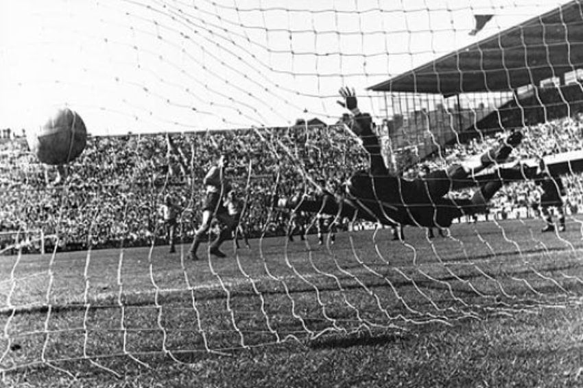
1950
Mexico arrived at the Estádio dos Eucaliptos Stadium in Porto Alegre, Brazil, for their last game of the 1950 tournament to find their burgundy kit clashed with the red shirts of their opponents, Switzerland. There was a 20-minute delay while the local side, Cruzeiro de Porto Alegre, rounded up their blue-and-white striped kit and lent it to the Mexicans. Incidentally, this happened again in 1978 when both France and Hungary arrived at the stadium with their second choice, white shirts. On that occasion, France played in the green-and-white stripes of the Argentinian Club Atlético Kimberley.
1958
The switch to a green shirt with red-and-white trimmings, colors inspired by the Mexican flag, finally came at the 1956 Pan-American Games. The World Cup kit two years later was a plain green shirt with a touch of red on the white shorts.
1962-1970
Green with various red-and-white touches has remained Mexico’s official colors in every World Cup since 1958. However, on several occasions, the team has reverted to the old burgundy colors for at least one of their games. This has not always been easy to explain.
While one of the teams is obviously obliged to change colors if there is a clash, what constitutes a clash is more complicated than it might seem. Television audiences have to be considered, and that could be tricky in the days of black-and-white sets, when blue and green shirts might appear on screen as similar shades of grey. In addition, shirts that were fine for an afternoon game might pose problems for an evening match played under floodlights.
Mexico tended to turn back to the darker shirts later in the tournament, leaving us to wonder if, after two games and two visits to the laundromat, the green shirts were simply feeling a little worn out.
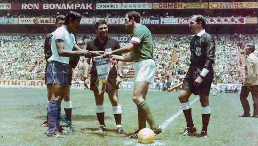
1978
Mexico failed to qualify for the 1974 World Cup, and when they returned to the tournament in 1978, burgundy had been dropped as their secondary color. For the opening game against Tunisia, they wore the new second jersey — a white shirt with broad vertical red and green bands — complemented by red shorts. The design was popular, but the tournament was a disaster for Mexico.
1994
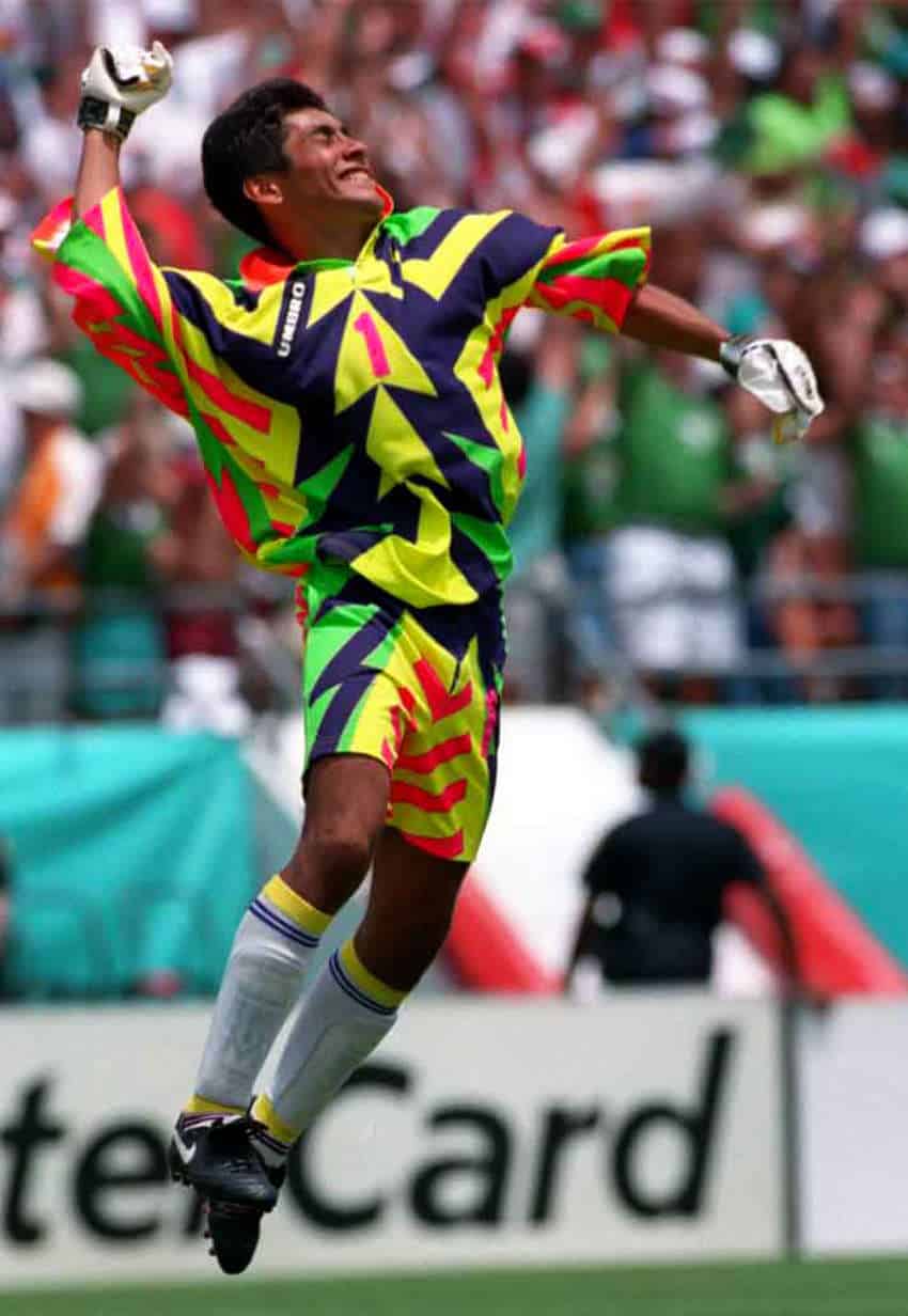
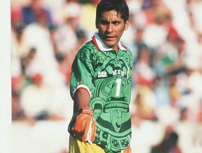
The great Mexican goalkeeper Jorge Campos was famous for designing his own kit, and none were more outlandish than the “hurt your eyes” shirts he wore in the 1994 World Cup. These unforgettable neon-colored designs reportedly took inspiration from the colors of his native Guerrero. But at 1.70 m, Campos was also small for a goalkeeper, and it didn’t hurt that the shirts were designed to make him appear taller.
1998
An all-time classic, and a design that has influenced this year’s kit. Enough said.
2022
Mexico stole the show in Qatar. Not only was the new green design a big fan favorite, but the second jersey with eye-catching Mexica designs in red was considered one of the best shirts of the tournament.
In a few months, thousands of supporters will be wearing the new shirts in the Azteca Stadium as they watch Mexico kick off their 18th World Cup campaign. It should be a colorful start!
Bob Pateman is a Mexico-based historian, librarian and a life-term hasher. He is editor of On On Magazine, the international history magazine of hashing.